Mutual of Omaha
Mutual of Omaha is a fortune 500 insurance and financial services company based in Omaha, Nebraska. Founded in 1909, the company offers services throughout the United States.
Visit Site
Mutual of Omaha is a fortune 500 insurance and financial services company based in Omaha, Nebraska. Founded in 1909, the company offers services throughout the United States.
Visit Site
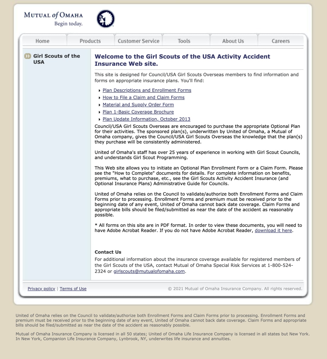
For over 30 years, Mutual of Omaha has offered insurance plans for the Girl Scouts of America. Mutual of Omaha hosts a few pages on their main site that contains details and forms that Girl Scout team leaders use to sign up for insurance and make claims. The site had been neglected and was in need of a UX and UI update.
We started off by reaching out to the Stakeholders in the project to gain a better understanding from their perspective of how the site is intended to be used and any problems they think were an issue. They explained to us that the site is given out to Girl Scout leaders before they go on a trip to sign up for insurance. Often, the leaders are looking for certain forms on the site to complete and email over to Mutual of Omaha. They noted that they had heard from users that finding the right form was difficult. They also noted that users had mentioned that it was difficult to navigate the site - they would frequently get lost and call in for help.
This gave us a great base to move forward with the project.

After speaking with stakeholders and users, we determined that there were several problems that needed to be addressed:
Based on the above problems determined, I worked towards addressing these pains by coming up with potential solutions:
I mocked up some basic wireframes to gather feedback from the Stakeholders, Developers, Senior Designers, and users on the overall layout of the new site. We tweaked a few things and continued on to high-fi design!
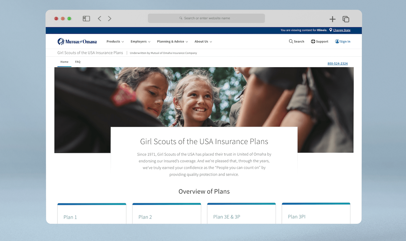
After getting feedback from users and team members, I was able to take the wireframes and turn them into hi-fi designs. I used design components already in the Mutual design library so that developers did not have to create anything new. I was able to work with a UX copywriter to shorten the paragraphs of copy to work with the more modern design. We also worked with Girl Scouts of America to get imagery for the site!
After getting feedback from people familiar with the site, we were able to set clear goals for ways the site could be improved. Navigation, readability, consistency, and ease of use were all things mentioned. We were able to take those ideas and create a new site using existing Mutual components.

New home page with new unified navigation.

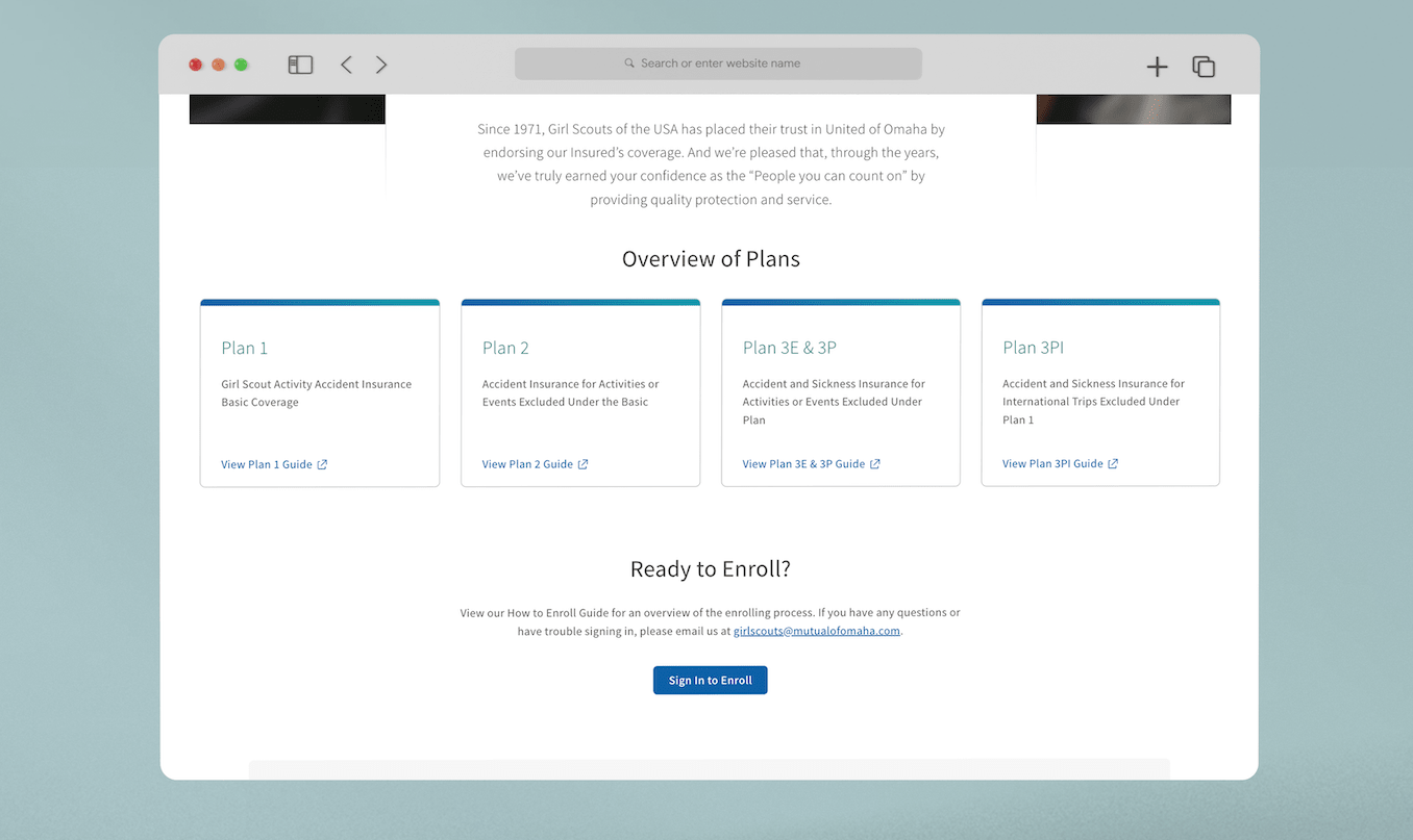
All plans are now in the same location with a description.

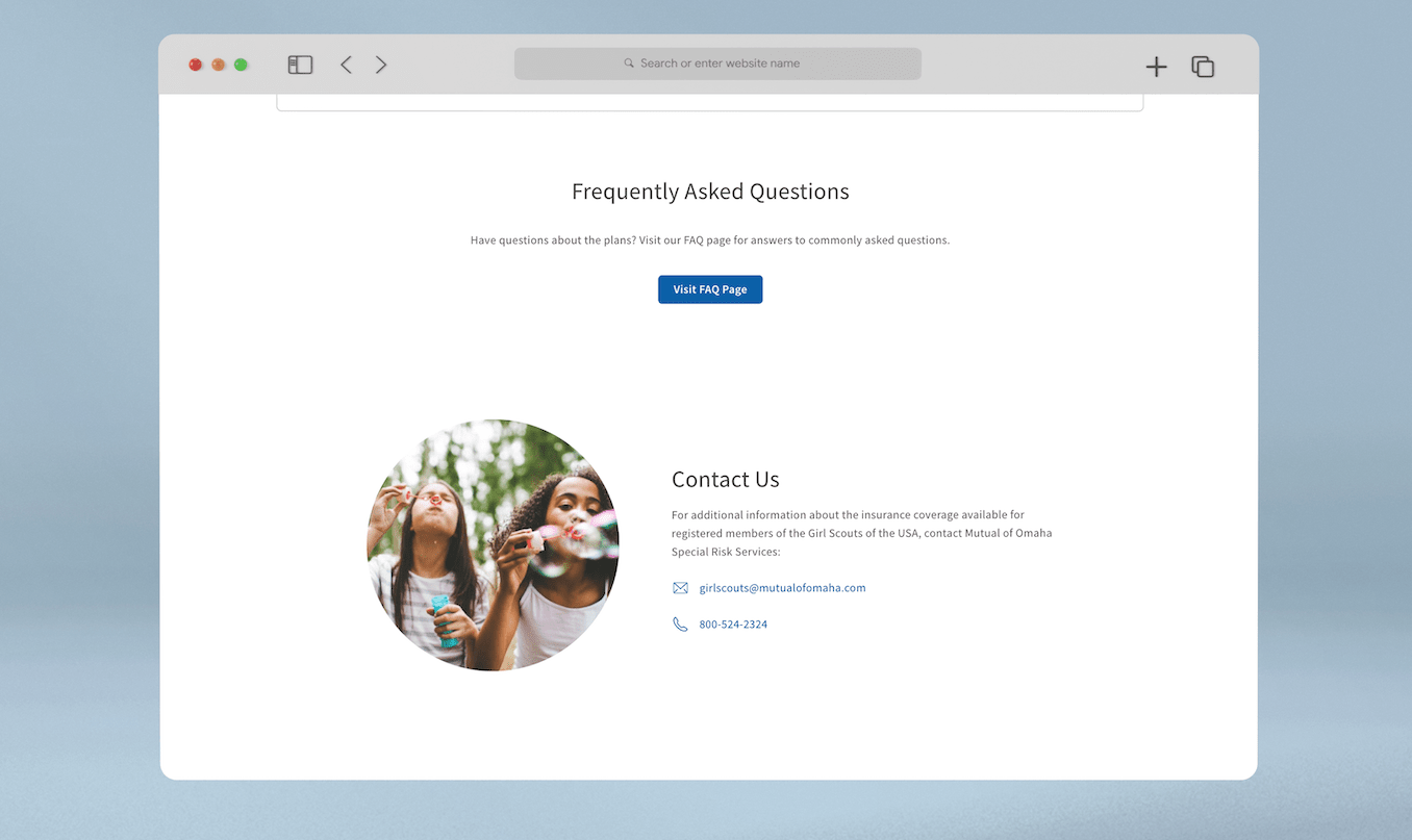
Easier to find contact information.

FAQ now all live on the same page and are grouped by plans.